Overview
Unlocking actionable housing trends across the nation’s top metros
In an era of shifting markets, having swift access to clear, comparative insights is essential for investors and real estate professionals. That’s why we built the U.S. Real Estate Market Insights: 5-City Comparison dashboard — to bring you real-time, side-by-side visual analysis of key housing metrics in five major U.S. cities. Whether you’re evaluating market entry, reallocating capital, or advising clients, this tool gives you the pulse of supply, pricing, demand, and performance—all in one place.
What’s Inside the Dashboard
Here’s how the dashboard helps you see the market from multiple angles:
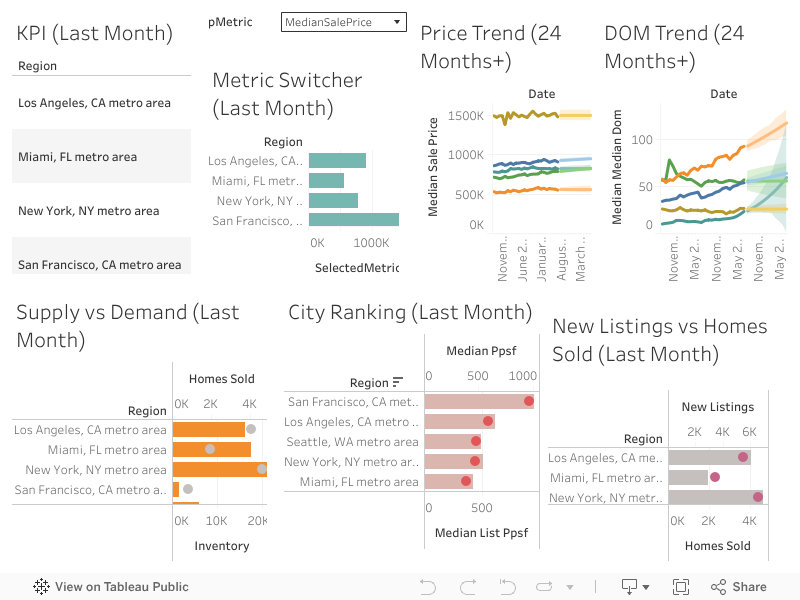
1. KPI Tiles (Latest Month)
These tiles surface the most recent values for your core metrics (Median Sale Price, Days on Market, Inventory, Months of Supply, etc.). At a glance, you can see which cities are leading or lagging in each dimension.
2. Price Trend (Last 24 Months)
A line chart showing how median sale prices have moved over two years. This helps you detect momentum, reversals, or plateaus in each city’s pricing trajectory.
3. DOM (Days on Market) Trend
How long homes are staying listed is a signal of buyer demand and market heat. Tracking DOM over time helps you spot tightening or cooling trends in each metro.
4. Supply vs. Demand (Inventory vs. Homes Sold + Months of Supply)
This chart juxtaposes how many homes are available (inventory) with how many are actually sold. With months of supply overlaid, you can see which markets are oversaturated or under-supplied relative to demand.
5. City Ranking (e.g. Price per Square Foot or Sale-to-List Ratio)
Ranking cities by price metrics or sale-to-list ratios shows you which markets are commanding premiums, which are discounting, and where negotiation power lies.
6. New Listings vs. Homes Sold (Dumbbell Chart)
The dumbbell chart offers a direct comparison between the number of new listings flowing into the market and how many homes are being sold. Gaps or convergence signal shifts in opportunity or market balance.
7. Metric Switcher (One Chart, Many KPIs)
Instead of building multiple charts, a parameter-driven metric switcher lets you use one visualization area to toggle between different KPIs. Want to see Price, then DOM, then Inventory? Just click and switch.
Key Takeaways & Insights (Example Themes You Could Draw Out)
A surge in new listings outpacing sales can be an early warning sign of oversupply ahead.
Cities with accelerating price growth may suggest stronger demand or limited supply, making them interesting for investment.
Rising DOM or expanding months of supply in a market may signal weakening demand or buyer fatigue.
Tight supply-demand balance (inventory low, sales high) often creates upward pressure on pricing.
Sale-to-list premiums or high PPSF (price per square foot) cities may indicate pricing power and competitive market dynamics.
How to Use This Dashboard in Your Strategy
- Market selection & comparison. Want to know which city is more bullish this quarter? Use the dashboard to benchmark side-by-side.
- Timing entry/exit. Spot trends before they become obvious — e.g. if a city’s price or days-on-market trends reverse.
- Client insights & storytelling. If you’re a realtor advising buyers or sellers, this visual tool helps you communicate in a data-driven way.
- Portfolio rebalancing. Investors can use metric shifts across metros to reallocate capital where opportunity or momentum is strongest.
Final Thoughts & Call to Action
This dashboard is more than a set of charts — it’s a decision-making engine. Whether you’re acquiring, selling, or advising, you can move with more confidence.
👉 Explore the U.S. Real Estate Market Insights: 5-City Comparison dashboard yourself.
👉 Share it with your team, clients, or network.
👉 Reach out for customized analysis — whether focused on a single city, region, or property type.
🔗 View the interactive dashboard:
U.S. Real Estate Market Insights: 5-City Comparison (Sep 2025)

Leave a comment