Introduction
Emergency rooms (ERs) are the frontlines of healthcare—handling everything from minor injuries to life-threatening emergencies. As patient demand rises, ER performance has become a crucial benchmark of hospital efficiency, patient satisfaction, and overall care quality.
This dashboard presents a data-driven view of ER wait times and service volumes across U.S. hospitals, helping stakeholders explore patterns in emergency care delivery.
Objective
To evaluate how U.S. hospitals perform in key ER efficiency metrics, including average time before being seen, time until admission, and patient volume, offering insights into care bottlenecks and operational performance.
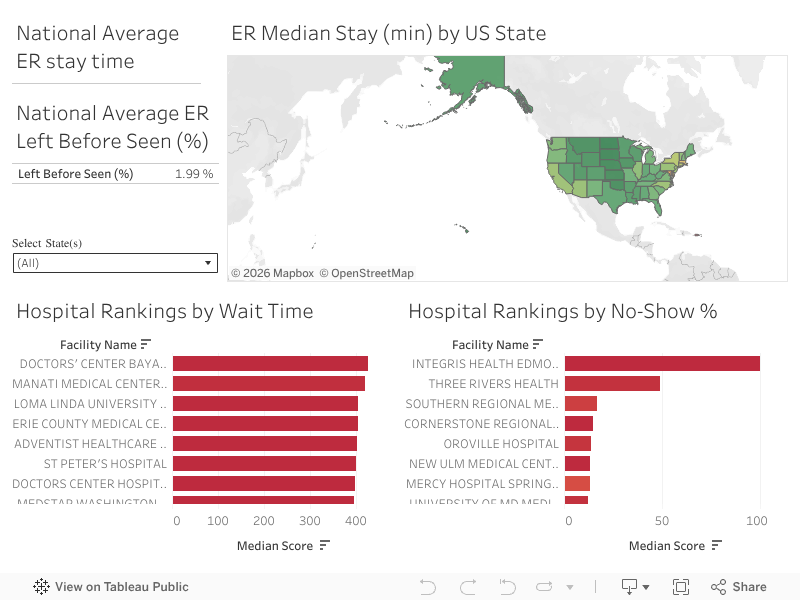
Dashboard Overview
The dashboard is designed with simplicity and clarity in mind. It includes:
1. Top 10 Hospitals by Longest ER Wait Times
Bar charts reveal the hospitals with the highest average time before a patient is seen by a healthcare provider—an important measure of urgency and access.
2. ER Volume by Hospital
This view displays which hospitals serve the largest number of ER patients. High volume can correlate with longer wait times or resource strain, depending on staffing and processes.
3. U.S. Map of ER Wait Times
A choropleth map visualizes state-level averages for ER wait times, helping to surface regional disparities. This offers context for how location influences emergency care access.
4. Interactive Filters
Users can refine the data by:
- State
- Hospital Name
- Performance range
This allows hospital administrators, analysts, and public health researchers to drill into specific areas of interest.
Key Insights
- Wait time variation is significant. Some hospitals average over 60 minutes before patients are seen, while others achieve much faster response times.
- High-volume hospitals are not always the slowest. Some facilities with large patient loads still maintain efficient care processes—highlighting strong operational models.
- State-level patterns show disparities in emergency care access, which may relate to hospital density, funding, or urban-rural differences.
Tools & Methods
- Data Source: U.S. hospital performance metrics (public data) LINK
- Data Preparation: Cleaned and filtered using Python (pandas)
- Visualization Tool: Tableau Public
- Design Goals: Emphasize ease of comparison, geospatial awareness, and performance visibility
Why This Matters
- Long ER wait times aren’t just an inconvenience—they can delay diagnosis, worsen outcomes, and reduce trust in the health system. By identifying patterns and outliers in ER performance, this dashboard supports conversations around:
- Staffing and triage models
- Patient flow management
- Regional investment in emergency care
- Hospital-level accountability and reporting

Leave a comment