Objective
The objective of this project is to analyze patient admissions data at Oceanside Medical Center to identify trends, peak times, and department-specific demand. By understanding these patterns, the hospital can optimize staffing, improve resource allocation, and enhance patient care.
The project was essential for Oceanside Medical Center because it provided crucial insights into patient admissions patterns, department demands, and peak times. With these insights, the hospital can optimize staffing schedules, allocate resources more effectively, and improve patient care quality. By understanding seasonal trends, demographic needs, and length of stay by department, Oceanside can better manage patient flow, reduce wait times, and ensure adequate support in high-demand areas. This data-driven approach enhances operational efficiency, patient satisfaction, and overall preparedness for fluctuating demands throughout the year.
Scope
This dashboard aims to deliver actionable insights on admissions trends, department utilization, peak times, patient demographics, admission types, and length of stay.Data Source
This dataset was generated to mimic real hospital admissions data, reflecting realistic patterns in patient flow across departments. The data includes 10,000 patient records over one year, capturing essential fields like admission date, discharge date, department, patient demographics, and type of admission.
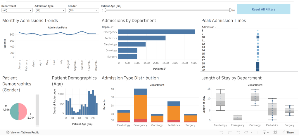
1. Admissions Over Time
We used a line chart to show monthly and seasonal trends in admissions across the year. This chart reveals seasonal patterns, with noticeable peaks in specific months, possibly due to flu season or scheduled procedures. These insights help with forecasting and planning resources in advance. There is no significant peak in admissions over the year at this medical center. However, we observe a slightly higher number of admissions in October, which may suggest a need for increased staffing and resources to effectively handle this seasonal demand.
2. Admissions by Department
We have a chart highlights admission counts per department, allowing us to identify high-demand areas. This chart shows that the Emergency and Pediatrics departments have the highest admission counts, highlighting areas where resources are most needed. With high volumes in Emergency, hospital management should focus on ensuring adequate staffing and equipment for this critical area.
3. Peak Admission Times
A heatmap represents peak admission times by day and hour, showing patterns in hospital traffic. The heatmap shows varied peak times across departments. For instance, Emergency admissions peak in the evening, while Surgery admissions are higher in the morning. Understanding these peak times allows the hospital to adjust staffing schedules, optimizing coverage during high-demand hours.
4. Patient Demographics
A pie chart for gender distribution and a bar chart for age groups give insights into the hospital’s patient demographics. These charts reveal that most admissions come from young (under 18) and elderly (over 60) patients, who often need specialized care. The age distribution suggests a need for tailored resources, such as pediatric specialists and elderly care programs, to meet these demographics’ unique needs.
5. Admission Type Distribution
A stacked bar chart illustrates the proportions of emergency, elective, and referral admissions. Emergency cases make up the largest share of admissions, followed by elective and referral cases. The high volume of emergency cases underscores the importance of maintaining flexible resources to handle urgent, unpredictable demand effectively.
6. Length of Stay by Department
A box plot compares the length of stay across departments, showing variations in patient turnover and resource needs. This chart shows that Oncology and Cardiology departments have longer stays, while Emergency tends to have shorter stays. Longer stays in certain departments inform bed allocation planning and suggest a need for managing patient turnover, particularly in high-demand departments.
Insights
Seasonal and Hourly Peaks
Admissions data shows clear seasonal peaks, particularly in winter months, and peak times vary by department. This helps in proactive planning for high-demand periods, allowing the hospital to allocate resources, adjust staffing, and prepare for increased patient volume.
Department-Specific Prioritization
Emergency and Pediatrics show the highest demand, indicating that these departments need continuous support with adequate staff and resources.
Targeted Care for Key Demographics
The age distribution highlights the hospital’s role in serving young and elderly patients, suggesting the importance of targeted resources like pediatric specialists and age-specific care protocols.
Balancing Admission Types
The high volume of emergency cases emphasizes the need for flexible resources. Having the capacity to manage both scheduled and emergency admissions smoothly is crucial to maintaining patient satisfaction.
Optimizing Bed Turnover
Departments with longer lengths of stay, such as Oncology and Cardiology, require careful bed management. Shorter stays in high-turnover departments like Emergency facilitate efficient patient flow and bed availability.
Conclusion
This Patient Admissions Dashboard provides a comprehensive view of patient flow, department utilization, and demographic needs. By leveraging these insights, Oceanside Medical Center can make data-driven decisions to enhance operational efficiency, reduce patient wait times, and improve the overall quality of care.
Based on these findings, recommendations include:
- Adjusting staffing schedules to align with peak admission times in specific departments.
- Allocating targeted resources for high-demand departments, such as Emergency, and demographic needs.
- Improving bed management in departments with longer stays to optimize bed turnover.
With these steps, Oceanside Medical Center can better meet patient needs, optimize resources, and ensure the hospital operates smoothly, even during high-demand periods.

Leave a comment